ShopDreamUp AI ArtDreamUp
Deviation Actions


![Adopt Auction 2 [CLOSED]](https://images-wixmp-ed30a86b8c4ca887773594c2.wixmp.com/f/d8047b66-da97-4eca-be64-62b11b3c03ce/d5n979h-7a4c8ded-6420-4967-8006-0d4e8c4cef9d.png/v1/crop/w_92,h_92,x_0,y_0,scl_0.13142857142857/adopt_auction_2__closed__by_millennium_star_d5n979h-92s.png?token=eyJ0eXAiOiJKV1QiLCJhbGciOiJIUzI1NiJ9.eyJzdWIiOiJ1cm46YXBwOjdlMGQxODg5ODIyNjQzNzNhNWYwZDQxNWVhMGQyNmUwIiwiaXNzIjoidXJuOmFwcDo3ZTBkMTg4OTgyMjY0MzczYTVmMGQ0MTVlYTBkMjZlMCIsIm9iaiI6W1t7ImhlaWdodCI6Ijw9NzAwIiwicGF0aCI6IlwvZlwvZDgwNDdiNjYtZGE5Ny00ZWNhLWJlNjQtNjJiMTFiM2MwM2NlXC9kNW45NzloLTdhNGM4ZGVkLTY0MjAtNDk2Ny04MDA2LTBkNGU4YzRjZWY5ZC5wbmciLCJ3aWR0aCI6Ijw9NzAwIn1dXSwiYXVkIjpbInVybjpzZXJ2aWNlOmltYWdlLm9wZXJhdGlvbnMiXX0.fmDDg6ZoMerhNAX3pdLv5yYLSUMUi67lL0hc-CKFgwI)


Suggested Deviants


Suggested Collections


You Might Like…


Featured in Groups


Description
EDIT: Fixed the BG 
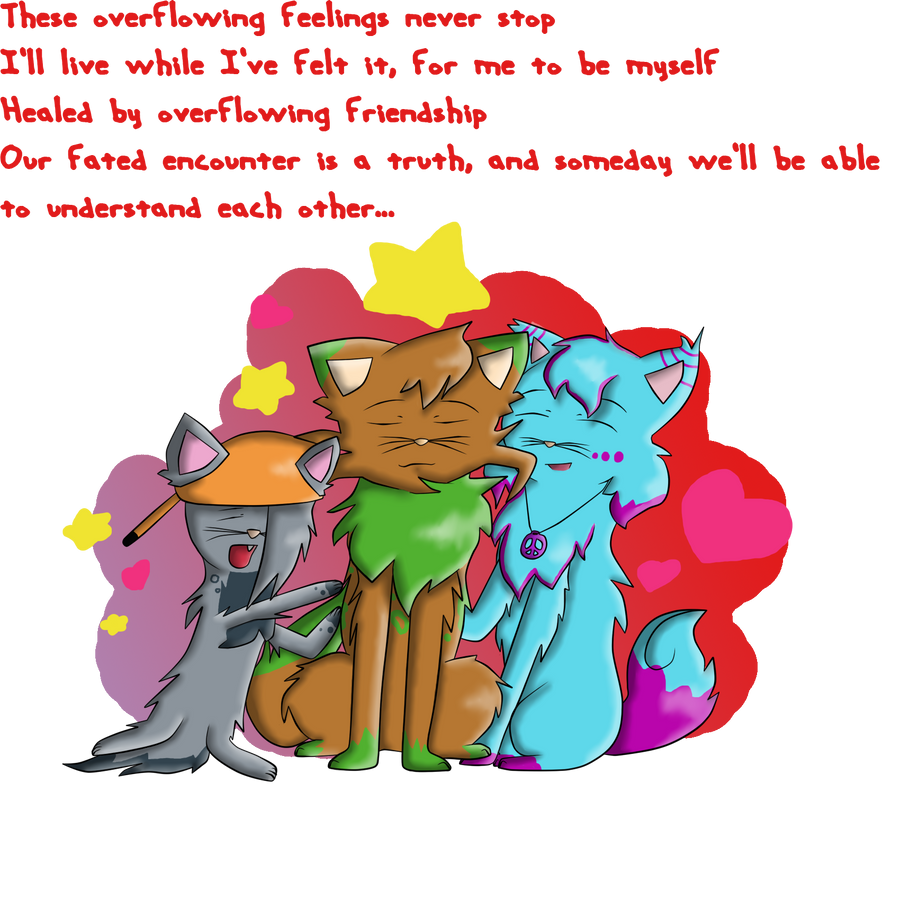
THIS IS WHY I'VE BEEN IGNORING YOU GUYS' REPLIES FOR THE PAST FEW HOURS ;A;
I'm finally glad to be done with this. It took me forever (Over 7 hours, to be exact) to do, and it wasted my studying time for the finals. But anyway, since I didn't like my old DA ID, I made a new one, based off of Yugioh Japanese Ending 4, Afureru Kanjyou Ga Tomaranai (These Overflowing Feelings Never Stop). I went all out and even made sure that the lines were proportionate when the image is flipped in Paint Tool SAI and when it isn't. That alone, was a pain. The second pain: SHADING. OMG. That's the part that mainly took me forever. I kept messing up my light source, and everything went haywire. So...yep. At first, I wrote part of the lyrics to the song using my mouse, but it didn't look right at all, so I just used a font. Oh, and also, THIS IS Kryysta's DEBUT...sort of. I adopted her from !Sea54311Shell a while ago, but she's banned now and all...so...yep. It felt great just drawing Forrester and Flitter again after a long while.
FEEL FREE TO CRITIQUE, COMMENT, AND FAV.
Oh, and I made a speedpaint for this ID, but it's extremely long. I'll post the link when the video is fixed a bit and is finished finalizing.
Tools Used:
Paint Tool SAI
Photoshop CS5
My Touchpad on my laptop
Forrester, Flitter, Kryysta, and art belong to me
Everything else goes to their respective owners.
Image size
1700x1700px 905.79 KB
© 2012 - 2024 Millennium-Star
Comments28
Join the community to add your comment. Already a deviant? Log In
Alright, lets starts with the not-so-goods.
NOT-SO-GOODS
 To me the words seem a bit out of place. Maybe they couldve been put in the center (like in Word, the way so the words start in the center)
With the character on the left, i think he looks fine except his legs and tail. It looks like hes sitting on his tail
****The back legs are not anatomically correct-- theyre like sticks, same as the front ones. Maybe make them a bot more... Flexible looking. Like the others hind legs
Maybe make the other cats legs thincker, and look more as if theyre part of the cat (mainky on kiddle one for part-of). As for the hind legs, the thighs might need to be up higher and not so chunky. The leg part needs to be bigger
The background is fine, but looks a bit shaky.
The whiskers seem like somewhat of a distraction. Maybe make them not so thick and long, and not connected to the nose (they arent in real cats)
GOODS
 I really like your style
I definitely get some emotion from the picture
The coloring is fantastic and so is the shading-- makes it very neat and catches your eye.
I like the fluffiness (if thats a word)
The background fading into a different color an dhaving different shapes on one side are both GREAT touches
I can definitely see the characters personalities
Now remember, this is supposed to be constructive
But overall, its great!
NOT-SO-GOODS
****
GOODS
Now remember, this is supposed to be constructive
But overall, its great!